Monday 9 May 2011
Thursday 28 April 2011
Evaluation
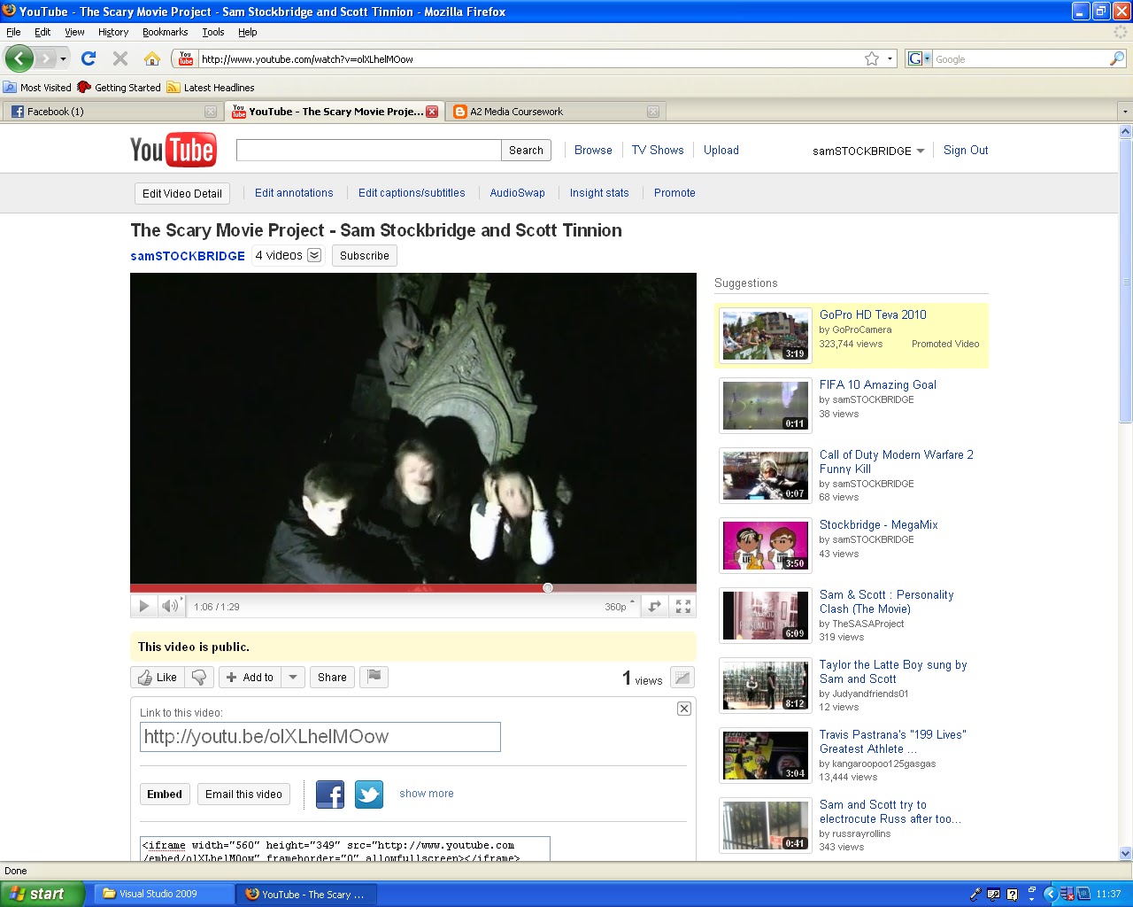
I will firstly focus on my trailer, As it is a spoof of the scary movie 'The Blair witch project' i felt it was necessary to analyse real horror films in my research and planning to give me idea's on the kind of features which are included in these films, which i could then invert and turn into humorous features which could fit in with the conventions of other spoof horror films such as the famous 'Scary movie' films. A feature which I looked to invert from scary to humorous was the idea of the main character being backed into a corner by the 'scary' character, this is seen in the shot shown below when an element of humour is involved due to the fact that the 'scary' character is literally inches from them.This can be seen below.

The idea for this shot was taken from my analysis of 'Eden Lake' which regularly showed the characters in vulnerable situations, i'm specifically referring to the shot shown below which shows the character to be in extreme danger. I felt this shot could be 'spoofed' as it allowed for the usual scary build up, but then could easily be made humorous as shown in my print screen above.

In this shot I followed conventions of spoof horror films by inverting the normally scary situations to a humorous one. I feel this had the effect of emphasising that my trailer was actually for a spoof horror film as it is not clear that it is just from the title and i felt it was important to push that idea through. I feel this would effect the audience in a way which allowed them to identify with the concept of a spoof horror film, which is turning normally scary situations into humorous ones. It was also have the effect of my making the audience laugh.
Another convention which i have followed in my trailer is the idea of low key lighting, which i used in the last half of my trailer. I feel this would have the effect of setting the scene as if it is really a horror movie. But then it could also help to make the humorous scenes even funnier because the lighting suggests its a conventional horror film. An example of the low key lighting is shown in the shot below.

An example of this low key lighting being a convention in typical horror movies is seen in the trailer for 'Creep'. It helps to build up the overall feeling of the scene and brings about a feeling of anticipation in the audience as to what could be hiding in the darkened area's of shots. I feel this was the effect in my trailer because it was used throughout the ending (as if it was a conventional horror film) but then contrasted to the humorous moments to emphasise these funny moments. An example of the low key lighting being used in 'Creep's' trailer is seen below.

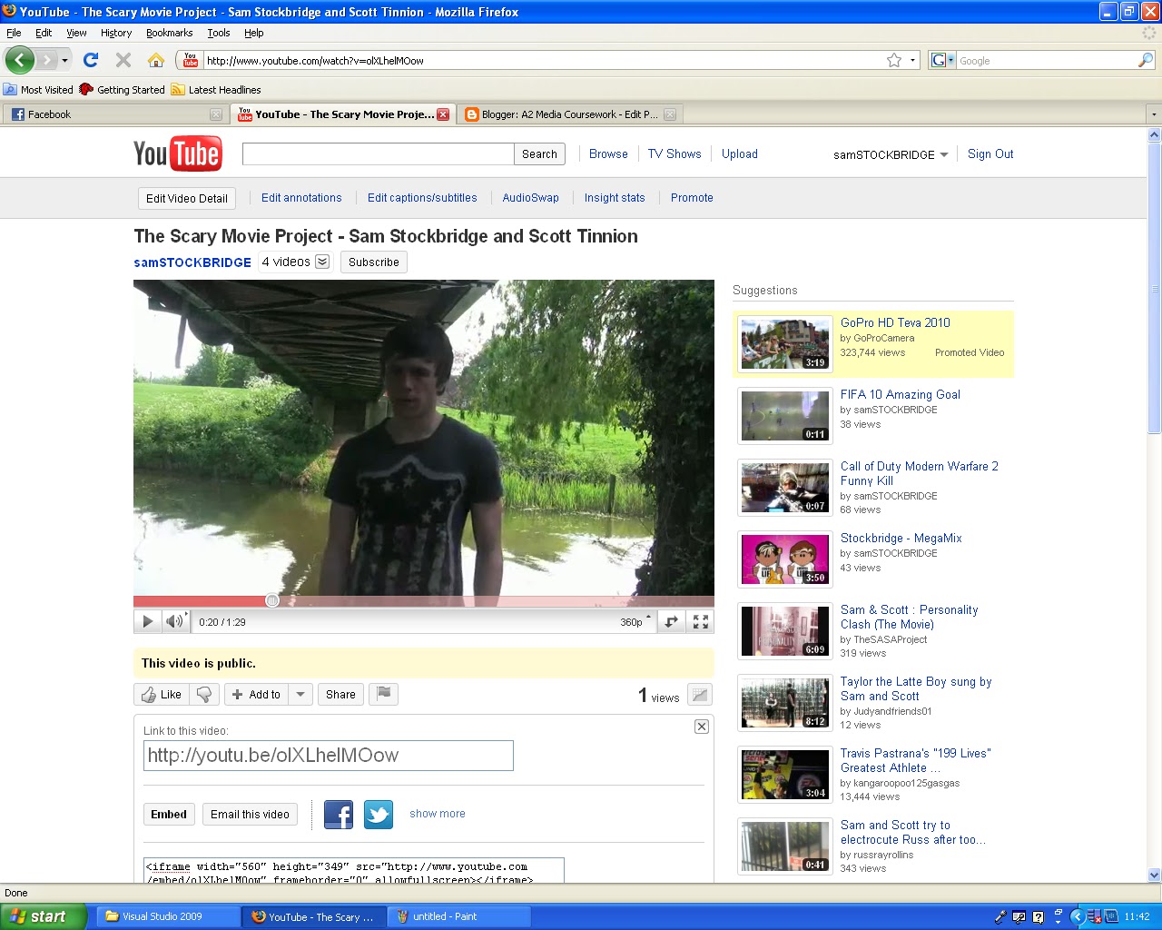
I will now look at how i have looked to challenge some conventions of conventional/spoof horror films. My first example comes from generally only using mid-shots throughout my trailer. This is challenging conventions of both spoof and typical horror films as they usually use a variety of different shots and angles. An example of a different type of camera angle is seen in the trailer for 'Final Destination 3' where a birds eye angle is used. This is seen in the image below.

I chose to only use mid-shots, and challenge conventions, as i wanted to bring a simple feeling to my trailer, as not to cause any confusion to my audience. I feel this would bring about the effect of simply emphasising the footage which is taking place, I felt it was important to give the actual scenes in the trailer the most coverage rather than possibly affecting them with extravagant camera angles/shots. An example of the mid-shot in use in my trailer is seen below.

I will now be focusing on how my poster either used or challenged conventions of similar media products. My first example comes from the layout of my magazine. I believe this is quite conventional as it follows the same pattern as other similar products. For instance I have a full screen picture with the title of the film in the middle along with credits at the bottom of the page, this is similar to that of the 'Creep' poster shown below.

This is similar to my product as i have pointed out below.

The similarities are clear between the two posters with each having very similar layouts. I believe sticking to this kind of convention allows the poster to be coherently viewed by the audience and is less likely to cause any confusion and allow the poster to have the maximum effect upon the viewing audience.
An example of me challenging usual conventions for a horror movie/spoof poster is seen in the large amount of text on my poster at the top. This is not the usual convention as most posters look to be instantly eye catching with extravagant pictures such as the one seen below.

The reason I looked to challenge this convention was because I felt it would be a good idea to intrigue the audience with the story of my spoof film rather than just presenting them with a picture. I felt the added text could add something different to the 'typical' film poster and allow my poster to stand out from similar genre posters such as the one seen above. I feel the audience would be enticed by the storyline which is presented on my poster and thus it would have the desired effect, which is to make them want to see the film.
I will now be looking for further examples of challenging/using spoof/horror film conventions in my front cover.
I feel the way I have used different fonts and also different colours throughout the text on my front cover coincides with the typical conventions which most front covers display when advertising a film. This has the effect of drawing the potential reader's eye to the magazine and therefore giving attention to the film's feature on the front cover. This is why i decided to use predominately red and white text as they both contrast each other well and also the use of different fonts, i believe will make those pieces of text stand out more on the page. These effects are shown below in my front cover.
 This following of conventions is seen from my analysis of the 'HD Review' magazine which is shown below.

This front cover also uses different colours for its text along with different fonts. I felt the interaction and variety between fonts and colours was vital in assuring the audience were instantly grabbed by my front cover and read on to the feature inside about my spoof horror movie.
Now I will look at an example of me challenging some conventions of film magazine front covers. This example comes from the fact that I have only chosen to use one picture on the front page; this is slightly unusual as it is the norm to use several pictures as to advertise a number of things, as seen on the 'HD Review' magazine. The reason I have only chosen to use the one picture is that I wanted to give maximum exposure to the feature about my movie, this is done by covering the whole front cover with the picture from my film and also making the words 'The Scary Movie Project' stand out on the page using different fonts and colours to other text on the page. This would instantly attract the audience to the main feature on the page, which is my film, therefore having the desired effect of giving my film increased exposure by making it the only main feature on my page.
In summary I believe that my decision to create a spoof horror film trailer in itself is challenging conventions as this is not typically a big market in which there are lots of films. I chose to create a spoof horror film as i felt this type of film was not in the public eye as much as they should be, even with the success of films such as 'Scary Movie'. Throughout my planning of my final product (especially my trailer) I created plans and drafts from which i was going to base the majority of my filming on, this ended up not being the case as i found that filming a spoof horror film based on an already written text was very difficult; but i did find on the other hand that natural occurrences in filming, e.g. human nature and instant reactions were very effective even though they weren't planned at all. Therefore this is why most of my trailer doesn't seem to match up with my planning and draft work, I instead preferred to start with my planned draft work and expand upon this to make my film even more effective and humorous.
In this section of my evaluation I am going to look at how well I combined my main task with my ancillary products. I believe that I have used continuity well throughout the production of all three aspects of my products, this is seen through my constant use of the font colours red and white in my poster and front cover, I believe this allows the audience to feel more familiar with my product and create an overall sense of continuity which i feel is important when trying to create a brand identity. Another example of continuity in my products is the similar costumes worn throughout the three products by the three main characters, this was a decision which i took to create a sense of familiarity with those characters with the audience, I feel doing this allowed for my products to be easily recognisable due to the style of the shots and the costumes being worn by the characters, which in turn would increase the popularity of my product in the long term.
My products overall aim was to target a specific target audience who were interested in spoofed horror films, I will now discuss whether I believed I achieved this aim. I feel one of the main goals was to successfully put across to the audience and emphasise the fact that my movie was a spoof and then build upon this fact with teaser clips from my trailer for instance. This would instantly grab my target audience and make them interested in my product. My planned series of events related to my three products would be first of all the intended audience seeing my poster which emphasises that it is a spoof horror film, with the use of humorous text for example. Then they read the front cover and feature inside the magazine which could give the audience member a deeper insight about the film and what it has to offer. The final event would be the audience member viewing my trailer and deciding whether or not they are going to see the film or not, I believe that my emphasis on spoofed features (e.g. humorous texts, funny clips) throughout my three products would entice my specific target audience into watching my film and ultimately proving the successfulness of my advertising campaign in targeting my target audience.
I will now look at where I feel would be most effective for my poster and trailer products to be placed in society as to receive maximum publicity. I feel my poster could be placed in a number of the typical locations for film posters with it successfully reaching a huge number of people, these could include in shopping centres, on the side of buses, on bill boards or in cinemas. Although these places will reach a huge audience it is not guaranteed that this audience will be interested in the film, this is why the trailer needs to be placed in more clever places for it to reach my specific target audience more directly. These could include on forums etc which discuss similar movies; for example if the trailer was placed on this link (http://my.spill.com/profiles/blogs/horror-spoofs) it could reach our target audience directly and create a degree of 'online hype' about the film. The trailer should also be placed on http://www.youtube.com/ to allow the trailer to reach a large audience, a benefit with placing it on 'YouTube' is that the audience member actually has to click a link to watch the trailer, therefore increasing the likelihood that the trailer is reaching my desired target audience.
To assess my successfulness in creating a brand identity for my product I will now look to compare my promotional package with that of a real movie to see how effective it was. I will be looking at the promotional package for the first 'Scary Movie' film; first of all I will view their poster, this can be seen below compared to my poster.


I feel that 'scary movie's' poster is more effective, at first glance, at telling the audience that it is a spoof horror film. This is done through the situation that the characters on their posters are put in, looking surprisingly comfortable around the suspected killer. This is not the case on my poster, i decided to use a more serious picture and couple this with humorous text which makes it clear its a spoof horror film, this was done because in my internet research on spoof horror films i found audiences still liked an interaction between traditional horror movie features and spoofed features. Therefore there are strengths and weaknesses to both posters with 'Scary Movie's' poster not fulfilling the desires of all of their target audience.
I will now look at 'Scary Movie's' trailer and compare it to mine to see how effective each one was at attracting our specific target audience. Each trailer can be seen below.
Each trailer emphasises well that the movie is a spoof film, but i feel that the length of 'Scary Movie's' trailer runs the risk of the audience member finding it tedious towards the end. This is part of the reason why i tried to keep my trailer to around 1 minute 20 seconds as to make it seem short and snappy but whilst also giving the audience all the encouragement they need to go and see my film. Where i think the 'scary movie' trailer has an advantage over mine is that it makes use of different kinds of camera shots/angles more than mine does which gives it a bit more of a professional look which could entice the audience more than mine can. But i feel that my trailer has the advantage in the way that it interacts with the traditional horror movie features and the spoof film features, I believe this allows my trailer to cater for all members of my target audience and increase its appeal to many. Where i feel both trailers are equally successful is in there use of music and sound effects to make the mood seem humorous, this is seen in my scene when my 3 characters are running, this is accompanied by fast paced music making the scene seem comical. An example of this is seen at 1 minute 35 in the 'Scary Movie' trailer in which fast paced music is played when the masked man is running down the stairs away from the piano. In summary i therefore feel that each promotional package has its advantages and disadvantages, but taking into account the disadvantages i still feel that each package could be successful in advertising their media product due to the potentially large audience each package could reach.
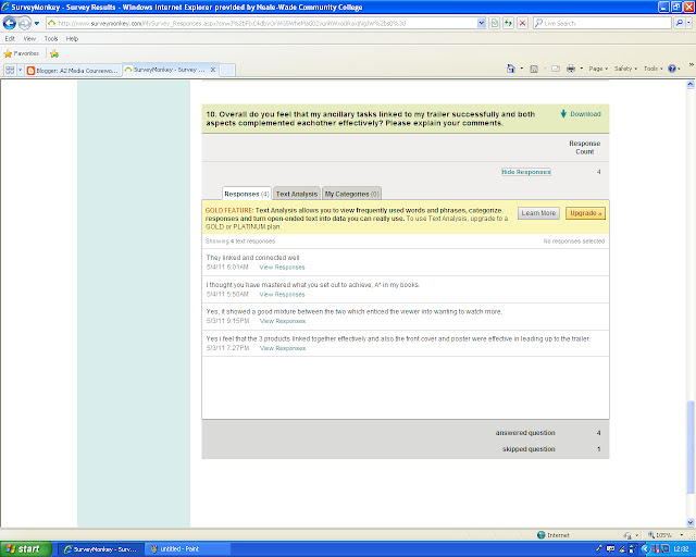
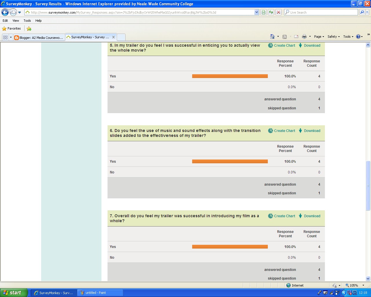
In the penultament section of my coursework I am going to be analysing the audience feedback I have gained from carrying out my secondary questionnaire (can be seen in my blog). In this questionnaire i looked to find out the strengths and weaknesses of all three of my media products. I also looked to discover people's opinions on whether they thought I linked the ancillary tasks to the trailer effectively. A total of 5 people carried out my survey, answering 10 questions each. In the first two questions I looked to discover whether the audience felt my two ancillary products were effective in catching the eye etc; I felt the products were effective in acheiving this and my target audience agreed with me, as shown in the question results shown below.

In my next two questions I looked to discover what the people thought of my thought two ancillary tasks, but these two questions required the person to actually describe what they thought of my ancillary tasks, in terms of effectiveness and inaffectiveness. I feel that my target audience would of found my colour and font interaction effective with them finding my lack of multiple colours inaffective. What the people filling out my questionnaire found effecive is summarised below.

What they didnt find effective is also shown below.

The next three questions are about my trailer. I tried to find out whether my trailer was enticing to the audience or not, whether they felt it introduced my film well and whether they found my sound effects and transtitions effective. I felt i did this effectively as it was my plan to try and support as many trailer conventions as possible and these seemed to be popular with the specified target audience. The below questions showed that I did appeal to my target audience effectively as there answers proved this.

The next two questions in my survey asked the participants what features of my trailer they found effective and what they didnt find effective. The question answers indicated that my target audince found my trailer "humorous" and they also found that the "characters had been fully briefed on their roles", one of the participants also expressed that "the transition slides etc, were very effective". These answers have suggested that i did appeal to my target audience. On the other hand some of the participants expressed views about my trailer which they didnt find effective, these include "poor lighting", they also felt that the trailer "could of been longer", furthermore it was also expressed that my "sound effects were slightly cheesy at times". This suggests that i havent appealed to all of my target audience, although to appeal to everyone in my target audience would be impossible. However this suggests that there are some weaknesses in my trailer which i need to address, these could include making my trailer longer, by including extra scenes for instance.
In my final question I have asked the participants to describe how they felt my ancillary tasks and trailer linked together and also how they complemented eachother. The answers to this question are shown below.
These answers suggested that I succeessfully linked my ancillary taks and main trailer together well. However to gain a fuller picture of people's opinions on my trailer i should of presented my questionnaire to more people, this would of given me more opinions which could have helped me in improving my trailer further.
Finally I am going to apply some audience theory concluded from my audience feedback. For instance Stuart Hall suggested that every media product is made with a preferred reading in mine, in the case of my trailer i would suggest that I wanted the viewing audience to find it both scary at times and also humrous throughout. According to Hall the audience would then react to this in either one of three ways; dominant, negotiated or oppositional. In relation to my audience feedback i suggest that the majority of my audience were in the 'dominant' bracket, this is because in questions 5,6 and 7 i had 100% feedback to my asked questions. Also in question 8 the views expressed concurred with my preffered reading with some of them giving the opinion that my trailer was "Humorous". But there is evidence in question 9 that not all of the audience agreed with my preffered reading, instead they decided to take a 'negotiated' view with someone expressing that they found the sound effects cheesy at times. It is not shown that anyone who took the questionnaire took a 'oppositional' view as there was no views expressed that completely rejected the appeal of my trailer.
In the final section of my evaluation I will be evaluating the use of the media technologies i have used throughout my coursework. I will firstly discuss the use of the blog format; I felt that the blog format was very useful in helping me to compile my work and also to organise it in to sub-sections such as 'research and planning' and 'Similar product analysis' for example. This allowed me to create a blog which was easy to understand and also very organised which allowed me to edit posts with ease. Another strength with the use of the blog was that it allowed me to display my work more effectively and to a wide range of people, this would not of been possible if i had hand-written my coursework for instance. It allowed my teacher to view my work easily and also helped when it came to him giving me feedback on how i could improve. The blog format was also very effective in allowing me to embed, upload videos, upload pictures and also to post links. This was very important as it was a necessary to allow people to see my finished product and also to view the similar products which i had analysed. An example of how easy it is to embed certain video's is seen below.


 The blog format was also very useful when it came to conducting my research and planning, an example of this is seen in my two questionnaires which i used in my coursework. The blog allowed me to embed my actual questionnaire which would make my survey even more accessible to people meaning my results from the questionnaire could only improve. As i previously mentioned the ability to link and embed videos was very useful in my research and planning as it allowed me to actually show someone viewing my blog what videos i had analysed. The blog format allowed me to publish my posts and organise them in a logical order from which i could go back and look at them again which was extremely useful when planning my final product.
In my research i used the internet, as well as other methods of information gathering, the internet was a useful tool in finding out about target audiences for spoof/horror films; this was one of the contributing factors that made me decide to produce a spoof horror film trailer. This is because I looked at reviews for for the film 'Scary Movie 3' and was inspired to create something as funny as that which the audience obviously loved, as was shown in the reviews. These reviews can be seen at this link http://www.imdb.com/title/tt0306047/usercomments.
In the creation of my product i used various technologies to help me in the creation of the product, these included a still camera to produce the shots for the front cover and poster. Using this camera was very effective as it allowed me to take high quality pictures in low light conditions by using the 'Flash' feature. In the filming of my product i used a video camera placed upon a tripod, although i had previously stated that i would be filming the trailer using a handheld technique i reconsidered this decision as i felt it could disrupt the quality of the filming and also i felt the tripod would be more than effective in capturing all the images which i needed to. A disadvantage with the use of the video camera was the fact that it didn't have a flash feature on it so i needed to use artificial light to brighten up the scenes.
After i had filmed my trailer i then had to edit, cut and 'put together' the separate clips so they all ran smoothly to leave me with a finished trailer. This process was completed on an 'Apple Mac' computer using a programme called 'iMovie', this process was extremely efficient and allowed me to include features such as transition slides, sound effects and background music in my trailer which added to the overall effectiveness of my trailer. An example of me using the 'Apple Mac' to edit my footage is seen in the screen grab below.
( include screen shot of me using the editing software on the mac)
In summary of the digital processes i used, aswell as the blog format, i have to say that these were the best practical methods i could of used to create and edit my product. The processes allowed me to film, edit and present my trailer to the best possible standard which i could of made it too. I would recommend these processes to anyone looking to carry out media coursework in the future.
The idea for this shot was taken from my analysis of 'Eden Lake' which regularly showed the characters in vulnerable situations, i'm specifically referring to the shot shown below which shows the character to be in extreme danger. I felt this shot could be 'spoofed' as it allowed for the usual scary build up, but then could easily be made humorous as shown in my print screen above.

Another convention which i have followed in my trailer is the idea of low key lighting, which i used in the last half of my trailer. I feel this would have the effect of setting the scene as if it is really a horror movie. But then it could also help to make the humorous scenes even funnier because the lighting suggests its a conventional horror film. An example of the low key lighting is shown in the shot below.

An example of this low key lighting being a convention in typical horror movies is seen in the trailer for 'Creep'. It helps to build up the overall feeling of the scene and brings about a feeling of anticipation in the audience as to what could be hiding in the darkened area's of shots. I feel this was the effect in my trailer because it was used throughout the ending (as if it was a conventional horror film) but then contrasted to the humorous moments to emphasise these funny moments. An example of the low key lighting being used in 'Creep's' trailer is seen below.

I will now look at how i have looked to challenge some conventions of conventional/spoof horror films. My first example comes from generally only using mid-shots throughout my trailer. This is challenging conventions of both spoof and typical horror films as they usually use a variety of different shots and angles. An example of a different type of camera angle is seen in the trailer for 'Final Destination 3' where a birds eye angle is used. This is seen in the image below.

I chose to only use mid-shots, and challenge conventions, as i wanted to bring a simple feeling to my trailer, as not to cause any confusion to my audience. I feel this would bring about the effect of simply emphasising the footage which is taking place, I felt it was important to give the actual scenes in the trailer the most coverage rather than possibly affecting them with extravagant camera angles/shots. An example of the mid-shot in use in my trailer is seen below.
I will now be focusing on how my poster either used or challenged conventions of similar media products. My first example comes from the layout of my magazine. I believe this is quite conventional as it follows the same pattern as other similar products. For instance I have a full screen picture with the title of the film in the middle along with credits at the bottom of the page, this is similar to that of the 'Creep' poster shown below.
This is similar to my product as i have pointed out below.

The similarities are clear between the two posters with each having very similar layouts. I believe sticking to this kind of convention allows the poster to be coherently viewed by the audience and is less likely to cause any confusion and allow the poster to have the maximum effect upon the viewing audience.
An example of me challenging usual conventions for a horror movie/spoof poster is seen in the large amount of text on my poster at the top. This is not the usual convention as most posters look to be instantly eye catching with extravagant pictures such as the one seen below.
The reason I looked to challenge this convention was because I felt it would be a good idea to intrigue the audience with the story of my spoof film rather than just presenting them with a picture. I felt the added text could add something different to the 'typical' film poster and allow my poster to stand out from similar genre posters such as the one seen above. I feel the audience would be enticed by the storyline which is presented on my poster and thus it would have the desired effect, which is to make them want to see the film.
I will now be looking for further examples of challenging/using spoof/horror film conventions in my front cover.
I feel the way I have used different fonts and also different colours throughout the text on my front cover coincides with the typical conventions which most front covers display when advertising a film. This has the effect of drawing the potential reader's eye to the magazine and therefore giving attention to the film's feature on the front cover. This is why i decided to use predominately red and white text as they both contrast each other well and also the use of different fonts, i believe will make those pieces of text stand out more on the page. These effects are shown below in my front cover.

Now I will look at an example of me challenging some conventions of film magazine front covers. This example comes from the fact that I have only chosen to use one picture on the front page; this is slightly unusual as it is the norm to use several pictures as to advertise a number of things, as seen on the 'HD Review' magazine. The reason I have only chosen to use the one picture is that I wanted to give maximum exposure to the feature about my movie, this is done by covering the whole front cover with the picture from my film and also making the words 'The Scary Movie Project' stand out on the page using different fonts and colours to other text on the page. This would instantly attract the audience to the main feature on the page, which is my film, therefore having the desired effect of giving my film increased exposure by making it the only main feature on my page.
In summary I believe that my decision to create a spoof horror film trailer in itself is challenging conventions as this is not typically a big market in which there are lots of films. I chose to create a spoof horror film as i felt this type of film was not in the public eye as much as they should be, even with the success of films such as 'Scary Movie'. Throughout my planning of my final product (especially my trailer) I created plans and drafts from which i was going to base the majority of my filming on, this ended up not being the case as i found that filming a spoof horror film based on an already written text was very difficult; but i did find on the other hand that natural occurrences in filming, e.g. human nature and instant reactions were very effective even though they weren't planned at all. Therefore this is why most of my trailer doesn't seem to match up with my planning and draft work, I instead preferred to start with my planned draft work and expand upon this to make my film even more effective and humorous.
In this section of my evaluation I am going to look at how well I combined my main task with my ancillary products. I believe that I have used continuity well throughout the production of all three aspects of my products, this is seen through my constant use of the font colours red and white in my poster and front cover, I believe this allows the audience to feel more familiar with my product and create an overall sense of continuity which i feel is important when trying to create a brand identity. Another example of continuity in my products is the similar costumes worn throughout the three products by the three main characters, this was a decision which i took to create a sense of familiarity with those characters with the audience, I feel doing this allowed for my products to be easily recognisable due to the style of the shots and the costumes being worn by the characters, which in turn would increase the popularity of my product in the long term.
My products overall aim was to target a specific target audience who were interested in spoofed horror films, I will now discuss whether I believed I achieved this aim. I feel one of the main goals was to successfully put across to the audience and emphasise the fact that my movie was a spoof and then build upon this fact with teaser clips from my trailer for instance. This would instantly grab my target audience and make them interested in my product. My planned series of events related to my three products would be first of all the intended audience seeing my poster which emphasises that it is a spoof horror film, with the use of humorous text for example. Then they read the front cover and feature inside the magazine which could give the audience member a deeper insight about the film and what it has to offer. The final event would be the audience member viewing my trailer and deciding whether or not they are going to see the film or not, I believe that my emphasis on spoofed features (e.g. humorous texts, funny clips) throughout my three products would entice my specific target audience into watching my film and ultimately proving the successfulness of my advertising campaign in targeting my target audience.
I will now look at where I feel would be most effective for my poster and trailer products to be placed in society as to receive maximum publicity. I feel my poster could be placed in a number of the typical locations for film posters with it successfully reaching a huge number of people, these could include in shopping centres, on the side of buses, on bill boards or in cinemas. Although these places will reach a huge audience it is not guaranteed that this audience will be interested in the film, this is why the trailer needs to be placed in more clever places for it to reach my specific target audience more directly. These could include on forums etc which discuss similar movies; for example if the trailer was placed on this link (http://my.spill.com/profiles/blogs/horror-spoofs) it could reach our target audience directly and create a degree of 'online hype' about the film. The trailer should also be placed on http://www.youtube.com/ to allow the trailer to reach a large audience, a benefit with placing it on 'YouTube' is that the audience member actually has to click a link to watch the trailer, therefore increasing the likelihood that the trailer is reaching my desired target audience.
To assess my successfulness in creating a brand identity for my product I will now look to compare my promotional package with that of a real movie to see how effective it was. I will be looking at the promotional package for the first 'Scary Movie' film; first of all I will view their poster, this can be seen below compared to my poster.
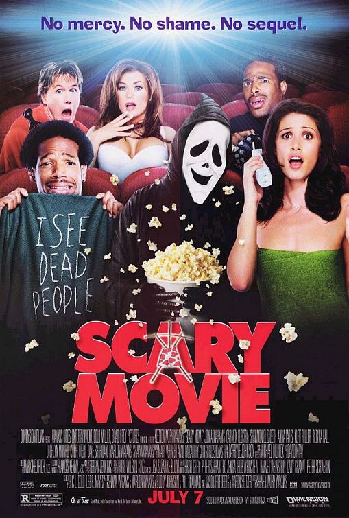

I feel that 'scary movie's' poster is more effective, at first glance, at telling the audience that it is a spoof horror film. This is done through the situation that the characters on their posters are put in, looking surprisingly comfortable around the suspected killer. This is not the case on my poster, i decided to use a more serious picture and couple this with humorous text which makes it clear its a spoof horror film, this was done because in my internet research on spoof horror films i found audiences still liked an interaction between traditional horror movie features and spoofed features. Therefore there are strengths and weaknesses to both posters with 'Scary Movie's' poster not fulfilling the desires of all of their target audience.
I will now look at 'Scary Movie's' trailer and compare it to mine to see how effective each one was at attracting our specific target audience. Each trailer can be seen below.
Each trailer emphasises well that the movie is a spoof film, but i feel that the length of 'Scary Movie's' trailer runs the risk of the audience member finding it tedious towards the end. This is part of the reason why i tried to keep my trailer to around 1 minute 20 seconds as to make it seem short and snappy but whilst also giving the audience all the encouragement they need to go and see my film. Where i think the 'scary movie' trailer has an advantage over mine is that it makes use of different kinds of camera shots/angles more than mine does which gives it a bit more of a professional look which could entice the audience more than mine can. But i feel that my trailer has the advantage in the way that it interacts with the traditional horror movie features and the spoof film features, I believe this allows my trailer to cater for all members of my target audience and increase its appeal to many. Where i feel both trailers are equally successful is in there use of music and sound effects to make the mood seem humorous, this is seen in my scene when my 3 characters are running, this is accompanied by fast paced music making the scene seem comical. An example of this is seen at 1 minute 35 in the 'Scary Movie' trailer in which fast paced music is played when the masked man is running down the stairs away from the piano. In summary i therefore feel that each promotional package has its advantages and disadvantages, but taking into account the disadvantages i still feel that each package could be successful in advertising their media product due to the potentially large audience each package could reach.
In the penultament section of my coursework I am going to be analysing the audience feedback I have gained from carrying out my secondary questionnaire (can be seen in my blog). In this questionnaire i looked to find out the strengths and weaknesses of all three of my media products. I also looked to discover people's opinions on whether they thought I linked the ancillary tasks to the trailer effectively. A total of 5 people carried out my survey, answering 10 questions each. In the first two questions I looked to discover whether the audience felt my two ancillary products were effective in catching the eye etc; I felt the products were effective in acheiving this and my target audience agreed with me, as shown in the question results shown below.

In my next two questions I looked to discover what the people thought of my thought two ancillary tasks, but these two questions required the person to actually describe what they thought of my ancillary tasks, in terms of effectiveness and inaffectiveness. I feel that my target audience would of found my colour and font interaction effective with them finding my lack of multiple colours inaffective. What the people filling out my questionnaire found effecive is summarised below.

What they didnt find effective is also shown below.

The next three questions are about my trailer. I tried to find out whether my trailer was enticing to the audience or not, whether they felt it introduced my film well and whether they found my sound effects and transtitions effective. I felt i did this effectively as it was my plan to try and support as many trailer conventions as possible and these seemed to be popular with the specified target audience. The below questions showed that I did appeal to my target audience effectively as there answers proved this.
The next two questions in my survey asked the participants what features of my trailer they found effective and what they didnt find effective. The question answers indicated that my target audince found my trailer "humorous" and they also found that the "characters had been fully briefed on their roles", one of the participants also expressed that "the transition slides etc, were very effective". These answers have suggested that i did appeal to my target audience. On the other hand some of the participants expressed views about my trailer which they didnt find effective, these include "poor lighting", they also felt that the trailer "could of been longer", furthermore it was also expressed that my "sound effects were slightly cheesy at times". This suggests that i havent appealed to all of my target audience, although to appeal to everyone in my target audience would be impossible. However this suggests that there are some weaknesses in my trailer which i need to address, these could include making my trailer longer, by including extra scenes for instance.
In my final question I have asked the participants to describe how they felt my ancillary tasks and trailer linked together and also how they complemented eachother. The answers to this question are shown below.

These answers suggested that I succeessfully linked my ancillary taks and main trailer together well. However to gain a fuller picture of people's opinions on my trailer i should of presented my questionnaire to more people, this would of given me more opinions which could have helped me in improving my trailer further.
Finally I am going to apply some audience theory concluded from my audience feedback. For instance Stuart Hall suggested that every media product is made with a preferred reading in mine, in the case of my trailer i would suggest that I wanted the viewing audience to find it both scary at times and also humrous throughout. According to Hall the audience would then react to this in either one of three ways; dominant, negotiated or oppositional. In relation to my audience feedback i suggest that the majority of my audience were in the 'dominant' bracket, this is because in questions 5,6 and 7 i had 100% feedback to my asked questions. Also in question 8 the views expressed concurred with my preffered reading with some of them giving the opinion that my trailer was "Humorous". But there is evidence in question 9 that not all of the audience agreed with my preffered reading, instead they decided to take a 'negotiated' view with someone expressing that they found the sound effects cheesy at times. It is not shown that anyone who took the questionnaire took a 'oppositional' view as there was no views expressed that completely rejected the appeal of my trailer.
In the final section of my evaluation I will be evaluating the use of the media technologies i have used throughout my coursework. I will firstly discuss the use of the blog format; I felt that the blog format was very useful in helping me to compile my work and also to organise it in to sub-sections such as 'research and planning' and 'Similar product analysis' for example. This allowed me to create a blog which was easy to understand and also very organised which allowed me to edit posts with ease. Another strength with the use of the blog was that it allowed me to display my work more effectively and to a wide range of people, this would not of been possible if i had hand-written my coursework for instance. It allowed my teacher to view my work easily and also helped when it came to him giving me feedback on how i could improve. The blog format was also very effective in allowing me to embed, upload videos, upload pictures and also to post links. This was very important as it was a necessary to allow people to see my finished product and also to view the similar products which i had analysed. An example of how easy it is to embed certain video's is seen below.


In my research i used the internet, as well as other methods of information gathering, the internet was a useful tool in finding out about target audiences for spoof/horror films; this was one of the contributing factors that made me decide to produce a spoof horror film trailer. This is because I looked at reviews for for the film 'Scary Movie 3' and was inspired to create something as funny as that which the audience obviously loved, as was shown in the reviews. These reviews can be seen at this link http://www.imdb.com/title/tt0306047/usercomments.
In the creation of my product i used various technologies to help me in the creation of the product, these included a still camera to produce the shots for the front cover and poster. Using this camera was very effective as it allowed me to take high quality pictures in low light conditions by using the 'Flash' feature. In the filming of my product i used a video camera placed upon a tripod, although i had previously stated that i would be filming the trailer using a handheld technique i reconsidered this decision as i felt it could disrupt the quality of the filming and also i felt the tripod would be more than effective in capturing all the images which i needed to. A disadvantage with the use of the video camera was the fact that it didn't have a flash feature on it so i needed to use artificial light to brighten up the scenes.
After i had filmed my trailer i then had to edit, cut and 'put together' the separate clips so they all ran smoothly to leave me with a finished trailer. This process was completed on an 'Apple Mac' computer using a programme called 'iMovie', this process was extremely efficient and allowed me to include features such as transition slides, sound effects and background music in my trailer which added to the overall effectiveness of my trailer. An example of me using the 'Apple Mac' to edit my footage is seen in the screen grab below.
( include screen shot of me using the editing software on the mac)
In summary of the digital processes i used, aswell as the blog format, i have to say that these were the best practical methods i could of used to create and edit my product. The processes allowed me to film, edit and present my trailer to the best possible standard which i could of made it too. I would recommend these processes to anyone looking to carry out media coursework in the future.


Wednesday 27 April 2011
Thursday 18 November 2010
Risk Assessment
The majority of our filming will be in a churchyard area. There are possible risks associated with this, i will discuss these and the possible solutions below.
Risk: Loose branches on the floor, which could be a trip hazard.
Solution: Before shooting, clear the area of loose branches.
Risk: A lack of light could cause visibility problems and therefore increase danger in the filming area.
Solution: Make sure we have appropriate lighting for the camera, and also, torches if we need them.
Production Plan
Our production activities will include still camera shots (to be featured on our poster and front cover). The date for our still shots will be the 22nd of November and the filming dates will be the following week on the 29th of November.
Locations for our still shots will be Station Road in the churchyard. It will be the same location for our trailer filming.
Costumes for both shooting sesssions will be casual youthful clothes to suit the characters in our trailer and to appeal to our target audience which is generally young people. For example blue jeans along with a polo shirt and white shoes.
The only technical equipment we will need for our shooting will be a video camera along with a camera and a tripod to shoot the still shots. We will need to get permission from our teachers to take this equipment outside of school.
The people involved in this project will be me (Scott Tinnion) and Sam Stockbridge. We will also need a male character along with a female character to correspond with the character line-up in the 'Blaire Witch Project' because this is the film we are doing a spoof horror film of.
Subscribe to:
Posts (Atom)